Brazilian Identity — Illustration & Motion System
Diagnosing a bank app with no visual identity of its own, and building an illustration and motion language rooted in Brazilian identity — its warmth, plurality, and everyday culture.
Context
I joined Will Bank as a Visual Designer focused on Motion Design, paired with illustrator Jaime Maia — the two of us brought in specifically to raise the level of craft across the app. The illustration library had grown fast alongside the product, piece by piece, without ever stopping to ask what it should look like as a whole.
Challenge
Running value-proposition dynamics with the product team, we mapped pains across the org.
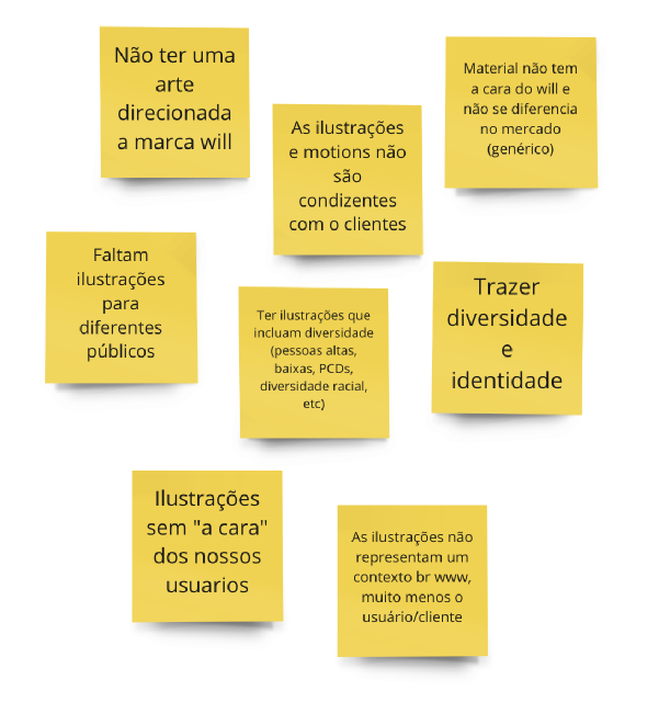
The lack of identity and diversity in our illustrations was one of the product team’s main challenges.
For a bank built on plural, everyday clients, the visual language wasn’t saying anything about who they actually were.
Process
Who is the Will client
Studied personas, gig-worker and freelancer research, interview transcripts, and an internal Facebook support group — trading assumptions for an actual picture of Will's plural client base.
Researching Brazilian identity
Surveyed the wider Illustration & Motion team (44 responses) on Brazilian personalities, food, objects, and competing apps — a first wave of references and the groundwork for a deeper study with real clients later.
The concept
Landed on Brazilian identity as the throughline — warmth, plurality, affective memory, collective unconscious — and grounded it in Brazilian folk art: cordel woodcuts, Tarsila do Amaral, Cândido Portinari, bonecos de Olinda.
Systemizing
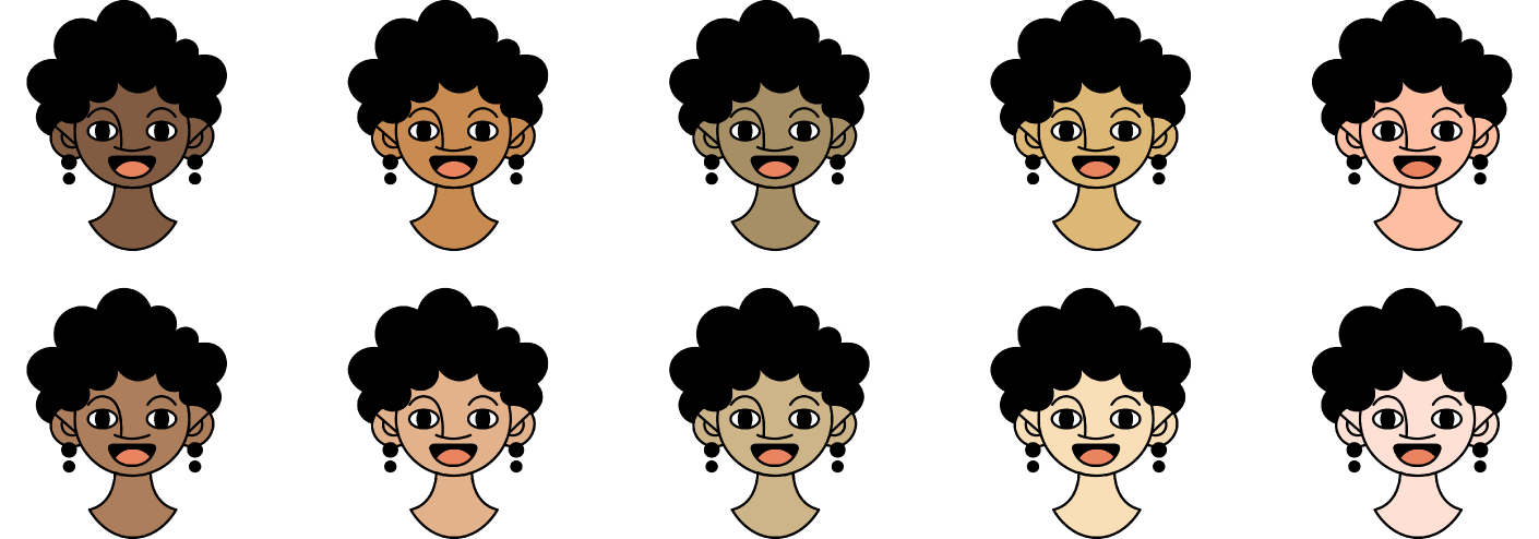
Built the new style around Will's 'positive banking' positioning, with the circle as the one recurring device, an expanded skin-tone and hair palette, and four clear usage categories: scene, spot, hero, avatar.
Why it mattered
That gap was the brief. Not “more diverse illustrations” as a checkbox, but a visual language that actually felt like it came from here.
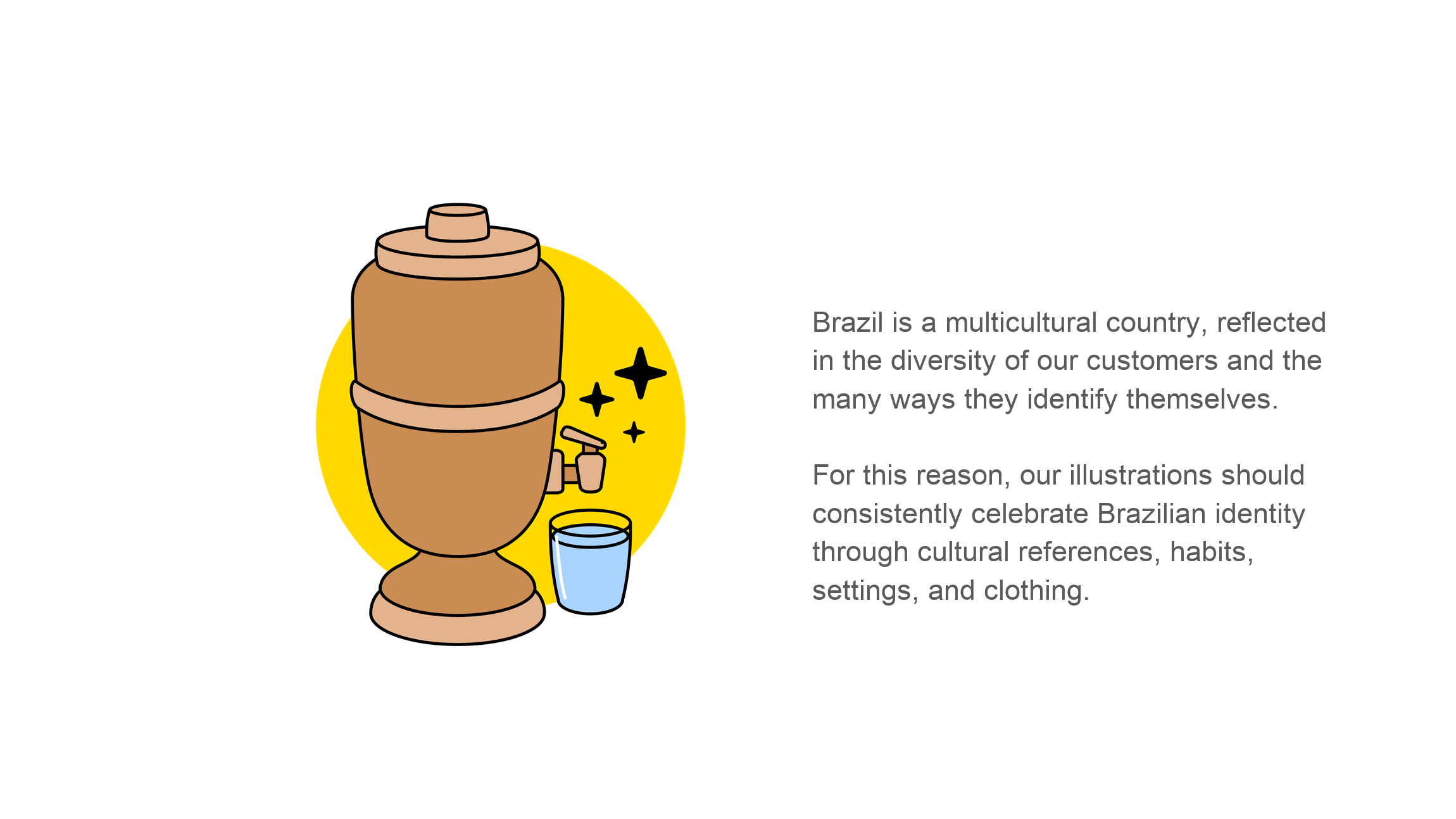
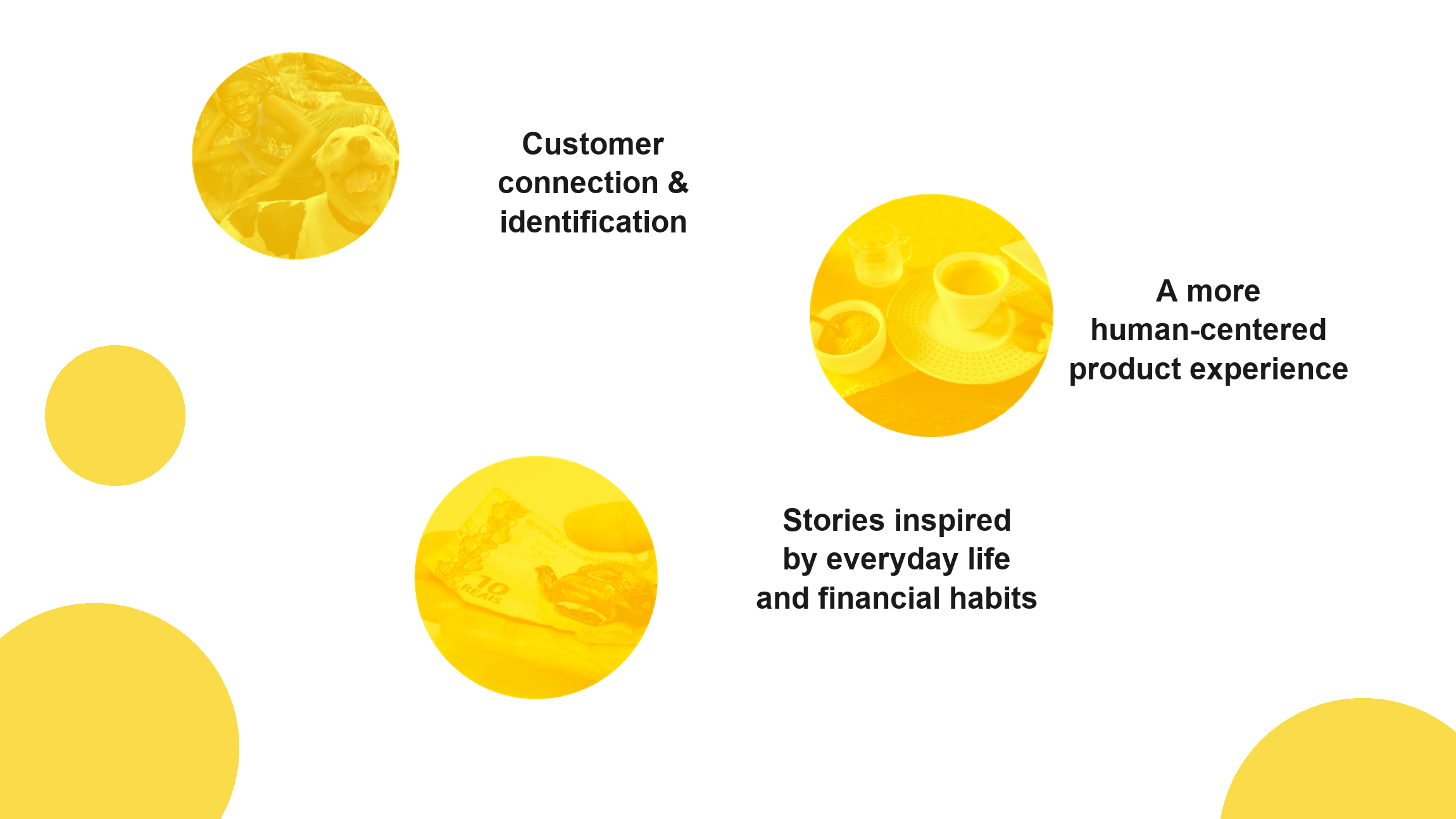
Food, music, humor, the jeitinho brasileiro — the plurality of who counts as Brazilian. That became the throughline for everything that followed:
The circle
One shape holds the whole system together — Will’s window to the world.
Sometimes it’s a backdrop, setting the scene behind a character in the foreground; sometimes it’s the protagonist itself, the frame a moment happens inside. Illustrations are built around circles and curved lines, reinforcing one of the brand’s key visual elements.
The Circle as a Visual Stage
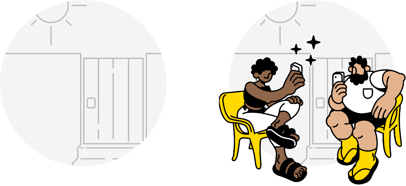
Illustration Categories
Every illustration in the new system falls into one of four categories:
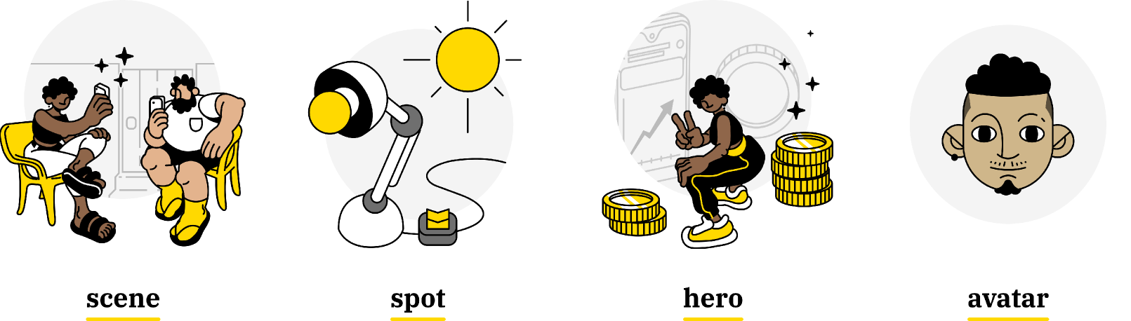
- Scene — complex ideas translated into clear and accessible visuals
- Spot — a direct and literal representation of objects or actions
- Hero — inspirational concepts expressed through playful metaphors
- Avatar — visual representations of subjective traits or personalities
Skin Tone Palette
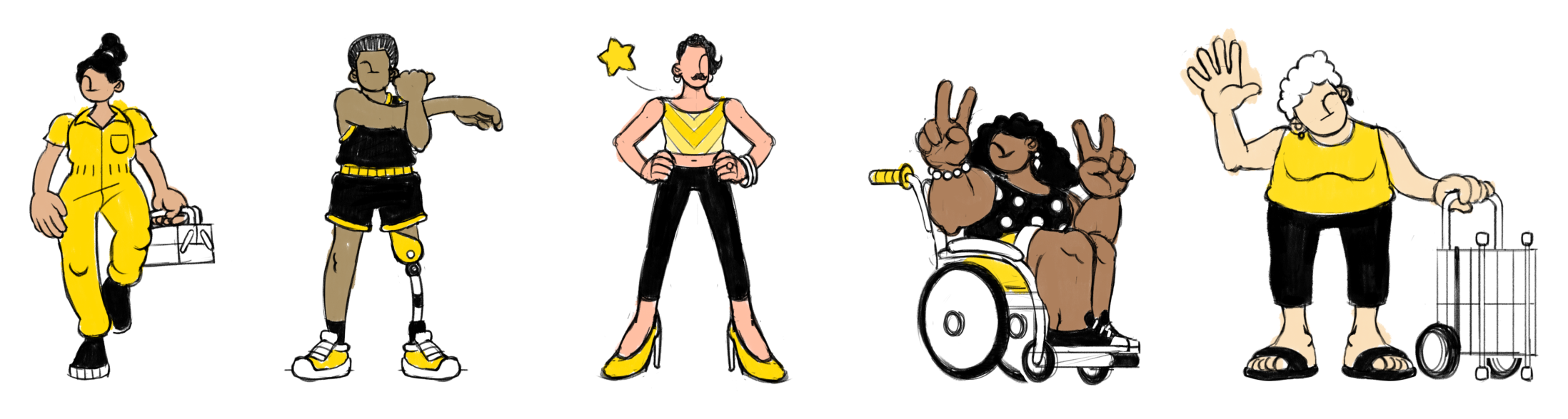
Skin tones and hairstyles were expanded well beyond the original set — and, deliberately, so was who gets illustrated: wheelchair users, people with prosthetics, older clients. Will’s clients, drawn as they actually are.
Built to last past us
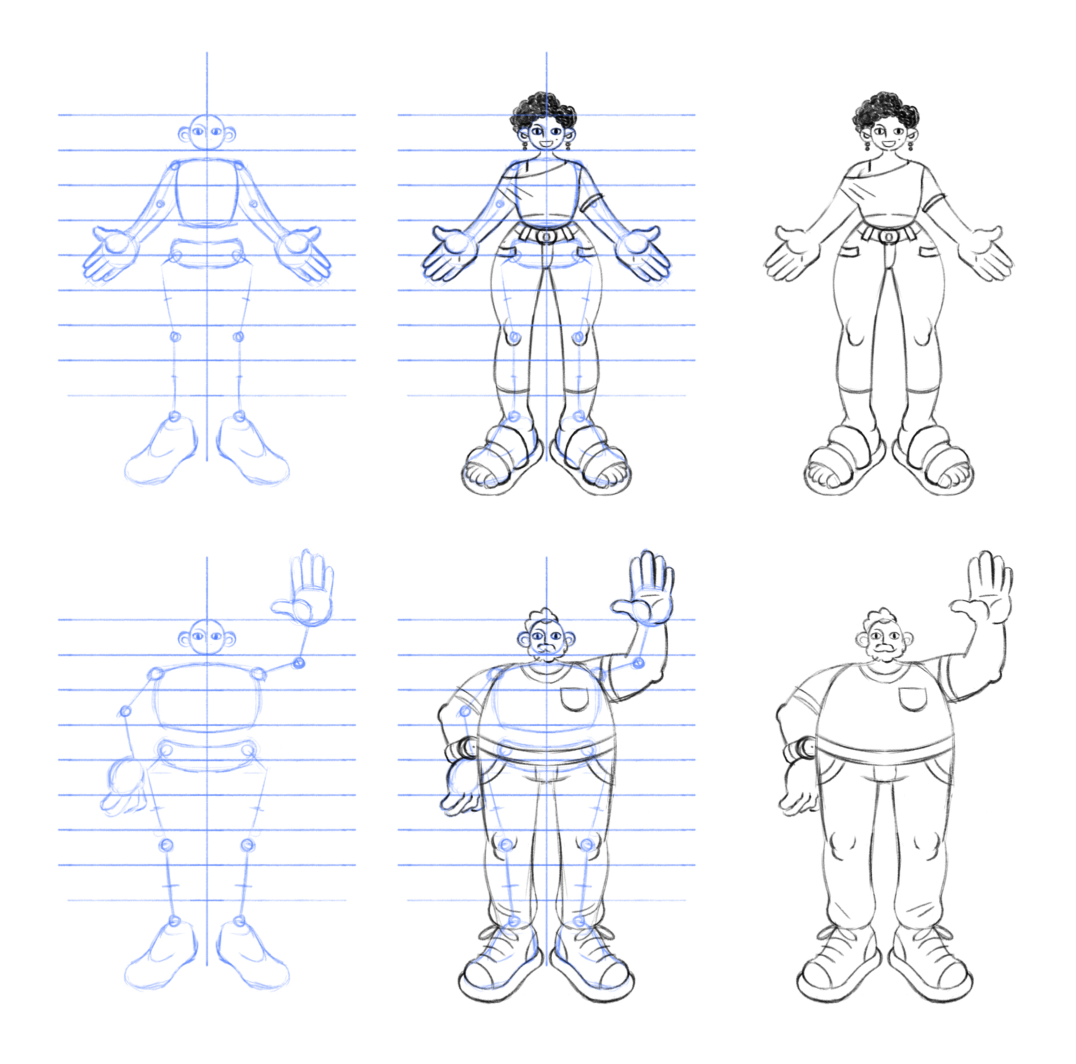
A new style is easy to lose the moment the two people who made it move on. So alongside the illustrations themselves, we shipped the system behind them: a guide for new illustrations, a guide for how and where to use them, a shared illustration bank in Figma and Drive, and an illustration system built like a “doll-maker” so anyone on the team could assemble a new, on-brand character without starting from scratch. Both product and marketing signed off on the new style through structured feedback rounds before it rolled out.
Anatomy rules were part of the same system: stylized body proportions, exaggerated large hands, and large feet — so any new character stayed consistent, no matter who drew it.
Outcome
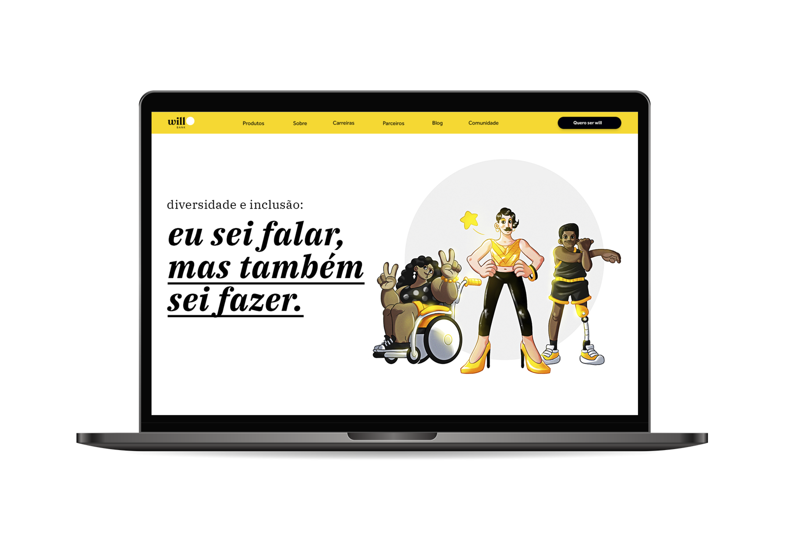
A core element of the brand identity — carried all the way to the website.
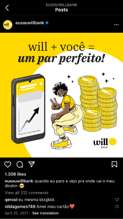
The new illustrations shipped across onboarding, product loading states, the redesigned site, social campaigns, and email marketing — replacing a generic, imported visual language with one built from the ground up around Will’s own clients.
Applications Across Products
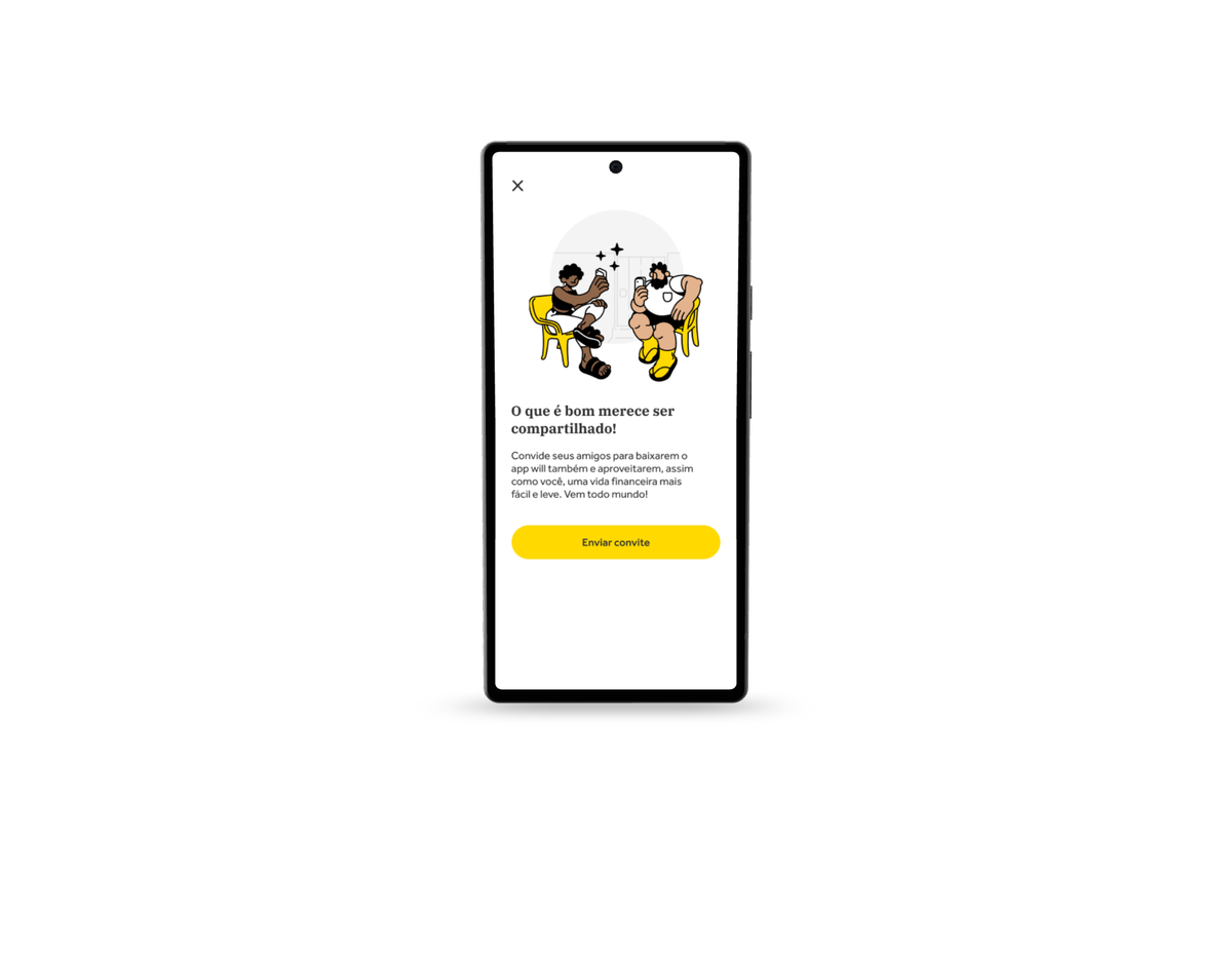
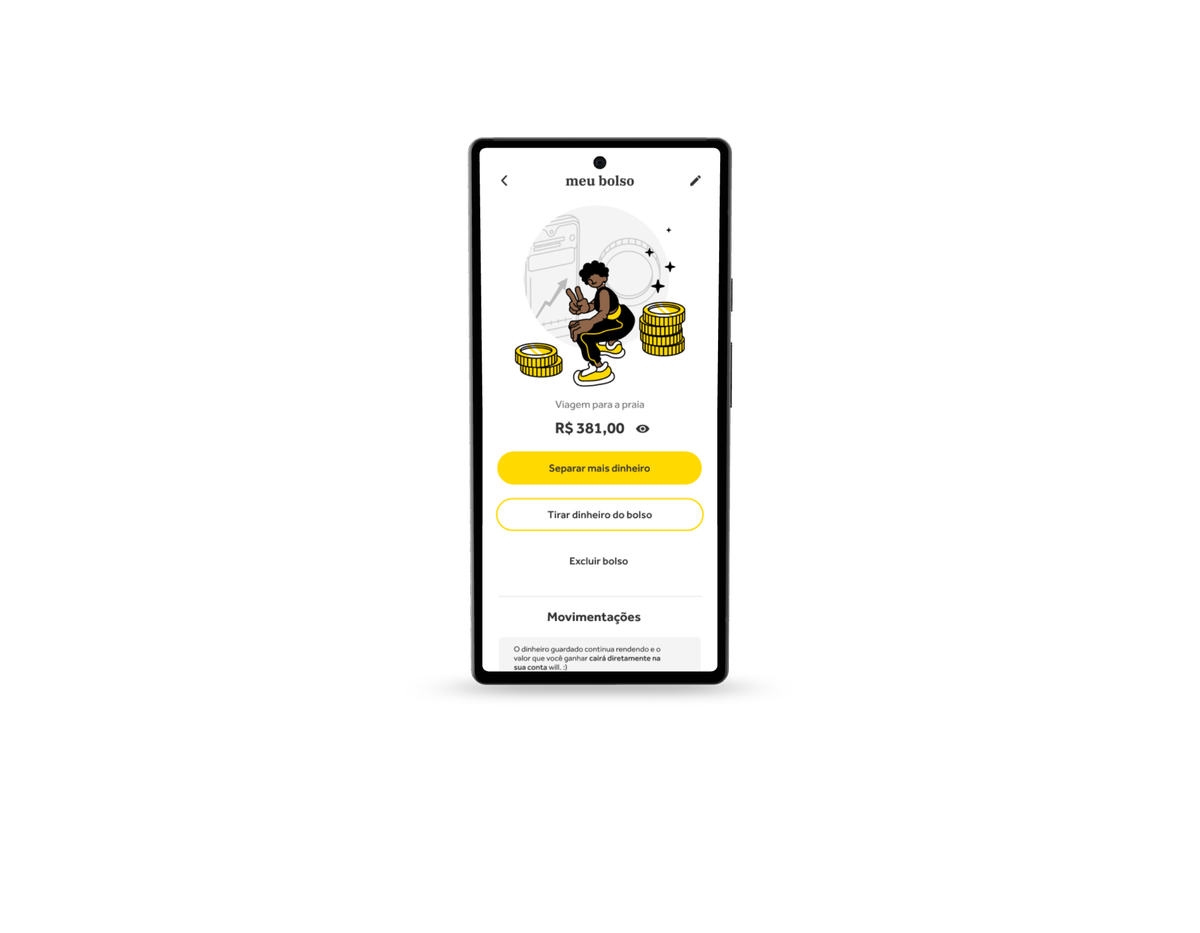
Social Media
Email Marketing
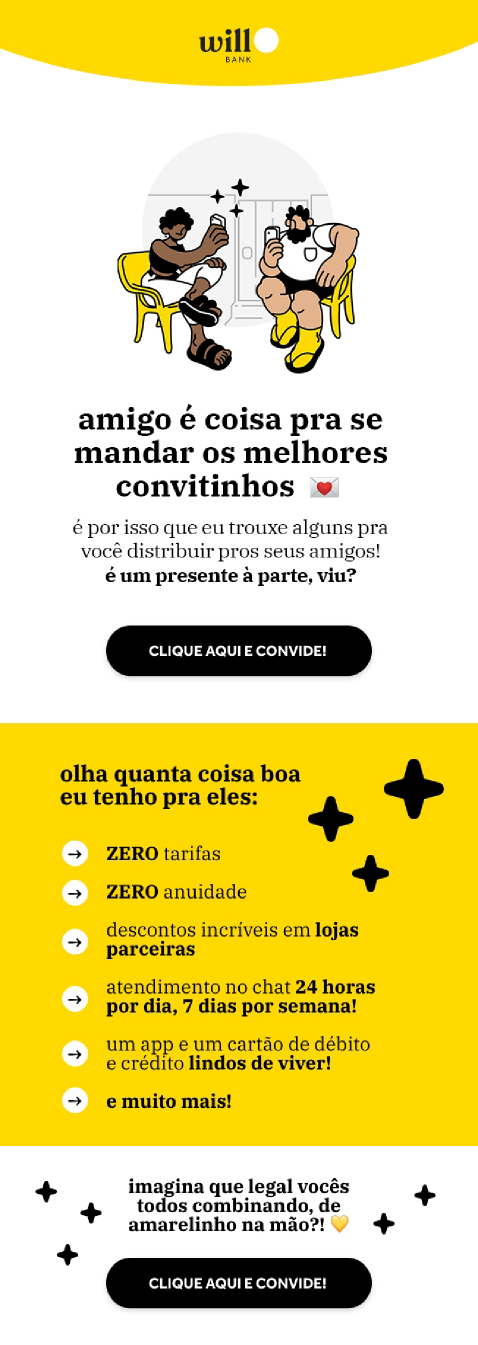
Validating narratives and identification directly with clients continued as an ongoing workstream past the handoff: the system was built to keep evolving, not to freeze the moment we left the project.
Motion Applications
Illustration was only half the system — motion carried it the rest of the way. Loading states, onboarding transitions, in-app celebrations: each one built from the same circle, the same characters, moving with the same “positive banking” energy the static illustrations set out to capture.
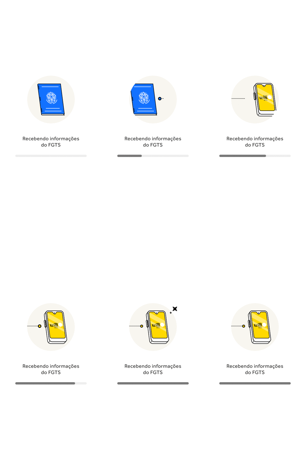
This section will grow with more Lottie files and reels from the project.
Credits
Concept & Research
Camila Santos, Jaime Maia
Motion & Execution
Camila Santos
Will Bank · 2022
Illustration & Execution
Jaime Maia
Will Bank · 2022